For the 1951-1980 normals, there is one radius scaling value on the data selection page. This value can be changed as appropriate for displaying the data appropriately, (circles not too big or too small), starting with the suggested ranges for the selected parameter.
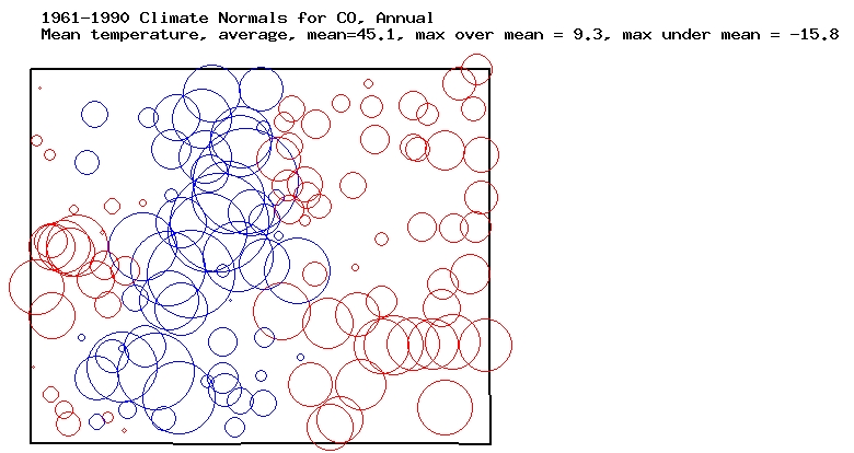
For the 1961-1990, 1971-2000, and 1981-2010 data, a default scaling value is provided for each available parameter. It can be changed as appropriate for displaying the data appropriately. The default radius scaling value for temperatures is 6, and that is the value used to produce the Colorado example.
For all 30-year normal data, so as not to "lose" a site with a parameter value very close to the statewide value, the minimum circle radius is 2 pixels. In states with relatively uniform topography, departures from statewide values will typically be smaller than in states with variable topography (mountains). If you wish to compare two or more states, make sure you use the same radius scaling parameter in each case.